
So, in the few moments I get here and there, I try and read what I can; usually in the pickup line at kiddo’s school.
Lately, I’ve been deepdiving into UX / UI – while I ‘can’ do graphic design, I’m much more of a get the idea out and its done. It also feels like the biggest weakness because it usually has no pizzazz or style.
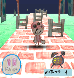
In my random bits of knowledge – I kept feeling like my mobile game just wasn’t good enough – it was distracting me. And it didn’t help that my neighbor’s little boy had a bit of trouble figuring out the gameplay. That smacks of poor design.
So – back to the sketchbook. Or sketchbooks, as it were.
My little art director has filled dozens of 18″x24″ newsprint pads, and still draws a lot to this day. So I dove into them, looking for anything that might be a better fit than the clock I had been using.

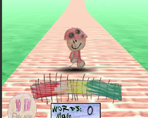
A slider bar! That is a lot easier to read – and I could put it right under Booper, so the player wouldn’t have to take their eyes off the action! Plus it frames the player and the play area nicely, and I could move the completed word counter right underneath the letter boxes. Much neater!
I might just be getting the hang of this dev stuff.