
Board game development is a very individual process. Every single developer has different methods for creating their games. This article is the tenth of a 19-part suite on board game design and development.
Need help on your board game?
Looking for more resources to help you on your board game design journey?
Accessibility is a big issue in board gaming. It’s also a very complex issue that is hard to talk about succinctly because it covers game design, product testing, individual behavior, and group behavior under a lot of different circumstances. To help understand this subject, I’ve brought in Dr. Michael Heron of Meeple Like Us.
But first, let’s go ahead and define accessibility, using Michael’s own words (paraphrased):
Accessible games are ones where people can still play your game even if they have extraordinary usability needs. An inaccessibility is any feature of a game that presents a barrier to enjoyment. Mostly it’s about how information is presented and how the game is manipulated, but I also include aspects of cultural inaccessibility and representation.
This guide comes in four parts:
- Who is Michael and what is Meeple Like Us?
- What is accessibility and why does it matter?
- Visual Accessibility
- Physical Accessibility
Below is a transcript of our conversation over Discord DMs. It has been lightly edited for clarity and flow.
Who is Michael and what is Meeple Like Us?
Brandon: Thank you very much for agreeing to help with this post!
Brandon: Tell me a little about yourself and Meeple Like Us.
Michael: I’m a lecturer in computing at Robert Gordon University in Scotland. My main research interests are accessibility, games, but especially accessibility in games. Previously I’ve been mostly focused on video games, with a special emphasis on games with unusual interfaces, such as text-based games. A couple of years ago I got into tabletop games in a reasonably big way, and as I saw my collection start to balloon I decided I need a way to pretend this was in some way an endeavour that had some applicability to my career. Thus began a study of the accessibility of tabletop games. That in turn resulted in Meeple Like Us where I document all my observations about the games I play.
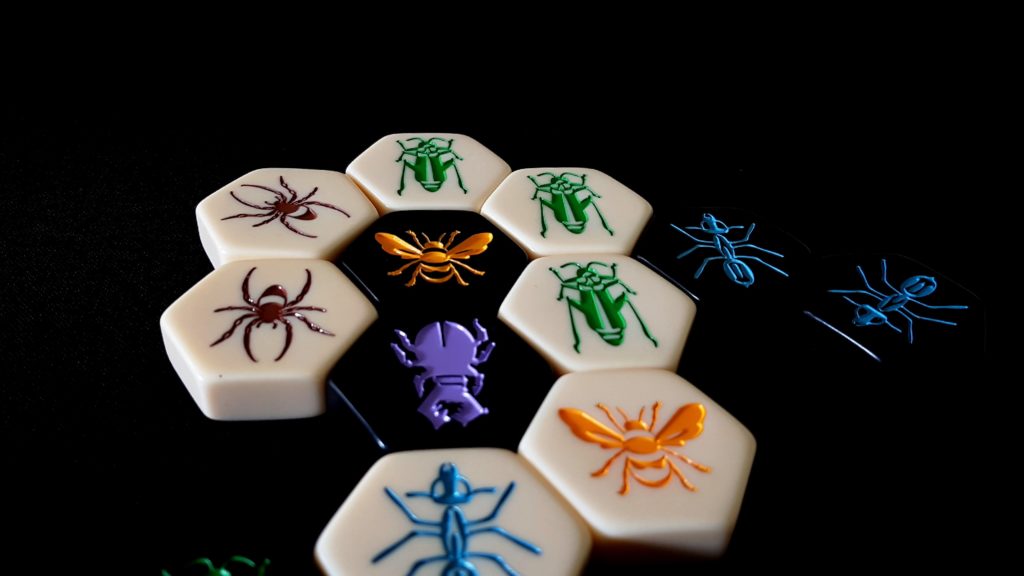
Brandon: You go into a lot of depth on Meeple Like Us, especially on board game accessibility teardowns. For those who haven’t had the pleasure of reading one, they cover eight different areas of game accessibility and show how well a game covers each one.
Brandon: Nothing comes out alive! Except for, I want to say Splendor, but correct me if I’m wrong here.
Michael: There haven’t been a lot of games that have come out unscathed, but really that’s not surprising – they’re being judged against criteria that are sometimes contradictory, sometimes counter to the game design, and sometimes just really, really difficult to meet. Some of the games that have come out smelling of roses have been Skull, Love Letter, Lanterns and most recently Blank and Wibbell++. Cottage Garden, as yet an unpublished post, also does very well. Mostly, games tend to fall down in one or two categories rather than across the board (although there are a few of those too). In the end, it’s not so much about complaining, but about trying to give people some insight into game elements that usually don’t get covered in reviews.
Brandon: Right, and the difficult criteria are not there to condemn, but rather to show ways in which game developers can make their games more accessible.
Michael: Yep, absolutely. One of the difficult things about designing for accessibility is that often the compensations for one category come at the expense of another. Icons can sometimes be good for visual accessibility (information dense while taking up small amounts of space), but be a problem from a cognitive perspective as an example.
Michael: So in a lot of cases it’s not pointing out mistakes, but pointing out where design or graphical choices are likely to be a problem for people.
Brandon: So it’s about making conscious choices that benefit as many people as you can.
Michael: Absolutely – inaccessibility comes at you from all kinds of angles and they’re often not obvious. Tales of the Arabian Nights, for example, is a mostly narrative game that is a problem for those with physical accessibility concerns purely because of the fact the spiral binding in the book tends to stick and becomes difficult to manipulate.
Michael: There are some clear, uncontroversial accessibility wins, but more often it’s a case of just trying to maximise the accessibility for the groups you’re looking to design for. A dexterity game likely won’t ever score highly for people with physical accessibility concerns. A game of pattern matching probably won’t be great for people with visual accessibility issues. It’s about being conscious of the inaccessibilities even if sheer pragmatics mean you can’t do much about them without changing a game into something different.
What is accessibility and why does it matter?
Brandon: So here’s an “easy” question.
Brandon: What, broadly speaking, is accessibility in board gaming? Why does it matter?
Michael: A quick definition of accessibility would be “people can play your game if they have extraordinary usability needs.”
Michael: An inaccessibility is any feature of a game that presents a barrier for someone when it comes to enjoying the game you’ve designed. I have a holistic approach to this that also includes aspects of cultural inaccessibility – that sometimes it’s not an aspect of a game as it exists but how that game is presented in its art, aesthetics or theme. Issues of representation are a big part of what gets talked about in each teardown. Mostly, though, it’s about how information is presented and how the game is manipulated.
Michael: It matters because a) there are a lot of people out there with accessibility needs, and b) we are all going to fall into that category sooner or later. The accessibility issues we discuss on Meeple Like Us aren’t just factors of disability, but also of aging. Assuming any of us ever get to retire, and assuming we want to play the games we never had time for in our working lives, we’re going to want them to be accessible.
Brandon: It’s a good way to include as many people in on the fun as possible – including ourselves in the future!
Brandon: Running with your definition, I’d like to point out that your own site splits it into eight broad categories, which I’ll just paste here:
- Visual
- Physical
- Cognitive (split into Fluid Intelligence and Memory)
- Communicative
- Emotional
- Socioeconomic
- Intersectional
Brandon: I’d like to dive into each of these in further detail.
Michael: Sure thing.
Visual Accessibility
Brandon: What are some ways in which games often fail to be visually accessible?
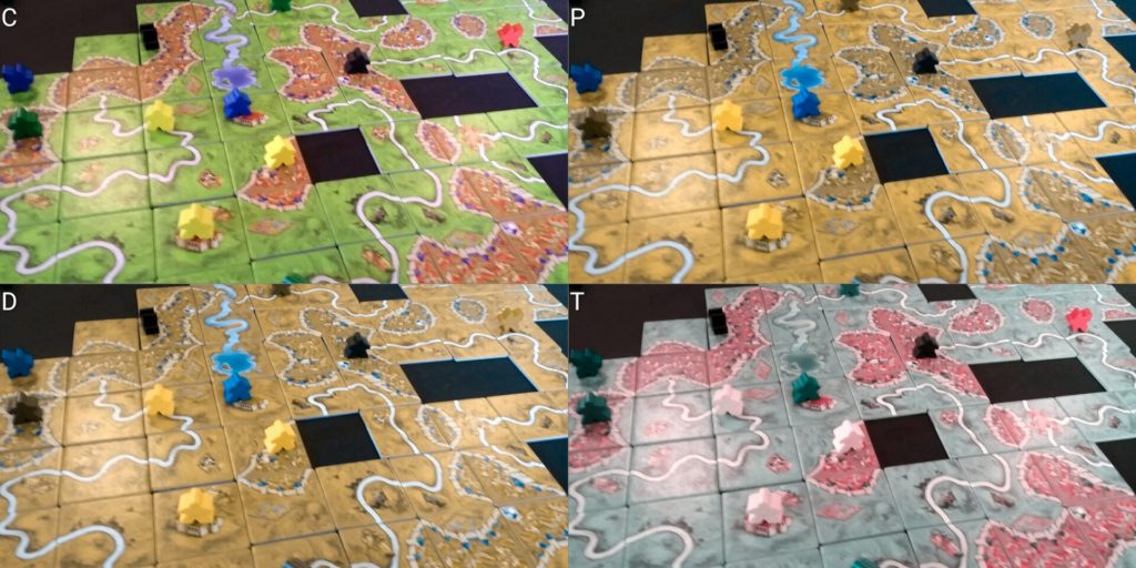
Michael: Well, the most common one is colour blindness – it amazes me that in 2017 we’re still seeing games that use palettes that are a problem, and not doubling up game elements with icons where it could be done. Other common inaccessibilities are tokens you can’t tell apart by touch (different denominations of money as an example), tiny text, random placement of game symbols, poor contrast, non-standard dice with special faces, paper money, and so on. More subtle things come in when you consider the realities of how people with visual impairments will interact with a game – touch where possible, as an example. That means that flimsy components tend to wear away over time.
Brandon: Colorblindness is the simplest thing to scan for. You don’t even have to use icons if you use a color-safe palette. Here’s an online tool you can use to simulate colorblindness.

Brandon: Tiny text is another usually straightforward fix because it’s usually covering up for overly verbose text – a larger problem.
Michael: Where possible, what you’re looking for here is redundancy of information – colours in a colour safe palette are great, but colour-blind senstive palettes with icons are better if you can accomodate that. That way you get around environmental issues such as poor lighting too.
Brandon: And visual accessibility can be improved on more heavily used components just by upping the physical quality of the goods, too.
Brandon: Doing one is good. Doing both is better.
Michael: Yep. 🙂
Brandon: Flipping the question, what are some easy fixes to improve visible accessibility?
Brandon: As opposed to invisible accessibility, I suppose. I meant “visual.”
Michael: Haha
Michael: Larger fonts, limiting ornamentation, good contrast ratios, consistency of component layouts are all useful. When using physical components, follow the design of physical coinage – if you look at denominations of coins in your pocket you’ll see they usually alternate size and shape which means that you can tell the difference by touch. You can adopt that with any chits and counters in the game.
Michael: And again, avoid paper money. That’s actually an interesting case study of accessibility in tabletop games. Because there are ways in which paper money can be made accessible in real life. Such as the folding method where different denominations are given a different folding pattern so you can tell them apart in a pocket or wallet. But that doesn’t work in a game purely because of how rapidly money circulates in a game economy.
Brandon: Or you can do what we do in the US with paper money and make everything the same length and texture 😛
Brandon: Same issue board games have, by the way, with paper money. That’s why you avoid it. It’s annoyingly hard to fix that in small print runs – punchout coins are almost always a better, more cost-effective, more accessible option.
Michael: Yep. I don’t have those accessibility issues, but I will almost always replace paper money in any game with poker chips.
Brandon: You can always replace paper money in games with pounds sterling if you want to keep it really interesting.
Michael: With the way Brexit is going, that’s probably also cheaper than using paper money.
Physical Accessibility
Brandon: What are some ways in which games often fail to be physically accessible?
Michael: The main problem in games with physical accessibility problems is that they sometimes don’t offer people easy ways to verbalise their instructions. If you’re playing with someone that is fully unable to interact with a game, most of them can still be enjoyable if instructions can be delivered clearly and simply. But many game boards don’t offer easy ways to refer to game locations, or lack grid references or landmarks, or so on. Tight constraints or fiddly pieces are a problem, as are many different components of different kinds. Card shuffling can be a big problem too, especially in deck builders. Again, consider the real world way games get played in these circumstances – often with card holders and card shufflers to alleviate problems. Except that may not work if cards have key information along the edges that get covered by a card holder, or non-standard card sizes that don’t work in a shuffler.
Brandon: In general, you want mechanics to de-emphasize fiddly actions as much as possible. And cut out parts when you can.
Brandon: Regarding physical accessibility, what best practices can you recommend for piece size, board landmarks/references, and card shuffling?
Michael: Bigger and chunkier is better, but there are obviously cost considerations there. Standard card sizes where possible, and as generous as you can be with physical proportions in board state and the like. Try to limit hand sizes, and provide alternatives to fine motor control – let people position rather than flick, for example. Position game information where it’s not going to be obscured by card holders. Also remember that a good insert can be a user interface tool in your game – a well designed insert can help limit game sprawl by permitting components to be kept in the box rather than on a table.
Michael: Mostly though, make sure it’s possible for people to unambigiously describe any action they want to take in the game and where they want to take it. If you have a map, provide landmarks. If you have a grid, provide chess style grid references.
Brandon: A simple grid overlay and using thicker tokens is a really simple fix, for example.
Brandon: That’s as easy as saying “2.5 mm punchboard instead of 1.8 mm” – very little material price difference and can be night and day for some.
In next week’s article, we’ll continue our conversation, focusing especially on the mental and emotional aspects of board game accessibility.
Often times, small tweaks and a general sense of awareness go a long way toward creating professional and polished board games. By exploring some of the ways we can make games more accessible, especially visually and physically, we can create games that more people can play. More fun for everyone!
Here are some key takeaways:
- Accessibility is about making games for as many people as possible.
- No game can be accessible in every situation. Accessibility is about practicing mindful design with your target audience in mind.
- Use colorblind-friendly palettes.
- Pair icons with colors when possible.
- Make tokens differentiable by touch.
- Use the largest font size possible.
- Use game symbols sparingly and deliberately.
- Make it high contrast.
- Try to avoid non-standard dice.
- Avoid paper money.
- Use consistent layouts.
- Make it possible for people to verbalize their instructions if they can’t touch the pieces. Include landmarks or a grid on your game if appropriate.
- Avoid tight physical placement and fiddly pieces.
- Avoid excessive card shuffling.
- Do not place critical information near the edge of cards.
- Use thicker pieces when possible (such as 2.5mm punchboard).
- Limit hand sizes when using cards.
Got any questions or comments? Leave them below, I’d love to read and respond to them 🙂


9 thoughts on “How to Develop Visually and Physically Accessible Board Games”