
When it comes to Kickstarting your board game, there is no shortage of complicated tasks which you will need to complete. You – or someone you outsource to – must be able to design a game, bring it into physical form, build an audience, and make sure there’s a market for it in the first place. However, one task, in particular, seems to get more attention than the rest: creating the perfect board game Kickstarter campaign page.
Need help on your board game?
Looking for more resources to help you on your board game design journey?
Let’s get two things out of the way first. First, a Kickstarter campaign page is not something you should ever rush. You should create a draft as early as you can and start outlining even your roughest thoughts. Nobody can see your draft unless you share it. Waiting until a week or two before the campaign to start creating your page is asking for a disaster.
Second, trends will always change. No guide can ever detail exactly what the optimal Kickstarter campaign page looks like because people’s expectations are fluid and best practices change. The campaign pages that got funded in 2015 don’t necessarily look like the ones that will fund in 2018. No matter when you’re reading this, whether it be 2018 or 2038, you need to look at ten pages that funded. Ideally, you want to look at the pages of highly funded games for campaigns whose games resemble your specific niche – sci-fi, worker placement, etc.
While trends are always changing, there are a few basic concepts that do not. Here are the four I’ve observed:
- All Kickstarter campaign pages must be fundamentally built to appeal to your target market. The page is about them, their desires, and how you can meet them.
- The campaign page must communicate all critical information clearly.
- Everything on the campaign page must be either tested, confirmed, or realistic. Never over-promise!
- It’s always ideal to get your audience’s feedback before you launch.
Kickstarter campaign pages tend to follow a basic structure. Every one of the items I’m about to list is in most, if not all, Kickstarter campaigns. They may or may not be in this order:
- An explanation of the game as a product
- How to play the game
- A list of what’s in the box
- Rewards
- A list of what’s left to do
- Game reviews
- Demos – print-and-play, Tabletop Simulator, Tabletopia
- Budget
- Shipping Costs
- Timeline
- Stretch Goals
- More information – such as your website and social media links
That brings me to the Kickstarter campaign video. The video must not be an essential part of the page since most people won’t watch it. The video only enhances your page, and must do so in a way that people find familiar and approachable. From my observations, videos are more subject to changing trends than the Kickstarter campaign pages themselves. Pay attention to those same ten games whose pages you checked out earlier. Ask yourself these questions:
- What information are they sharing in the video?
- How long is the video?
- Who is featured in the video?
- What is the production quality?
Play it safe when it comes to creating Kickstarter videos. You want to show some personality in them, but you want to make sure you’re keeping the four questions above in mind. Successful campaigns tend to have a better idea of what information to share, how long to make the video, which of their staff to include in the video, and how nice the video should look. When in doubt, mimic the successful companies you see on Kickstarter. That may even include renting high-quality video equipment or asking a video crew to help you.
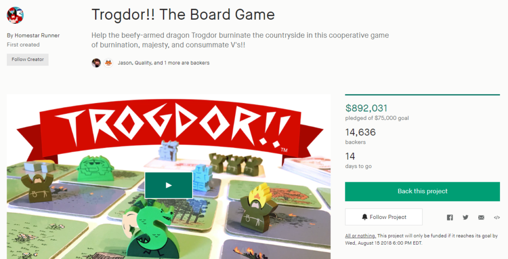
So how does all this relate to a real, live, non-theoretical Kickstarter campaign? That’s a good question and one that I’ll answer by an in-depth look at Trogdor!! The Board Game. By the time you read this post, it’s probably going to make a million bucks. It’s a good example, and frankly, it’s fun to talk about Strong Bad (of Homestar Runner fame). Again, when you do this for your own game, you need to pick games that look like your own. This isn’t traditionally “board game-y” but that casts their business decisions in stark relief for us here, and that makes for good analysis.
The page follows this basic structure, which is tried and true: stretch goals, description, list of components, how to play, rewards, stretch goals again, add-ons, reviews, backstory, social media, shipping rates, and a thank you section. Pretty straightforward, but I’d like to point out something critical: despite being a well-established (and awesome) intellectual property, they talked primarily about the game – not Homestar Runner.
Here are three quick observations that tell me they’re not just cynically cashing in here:
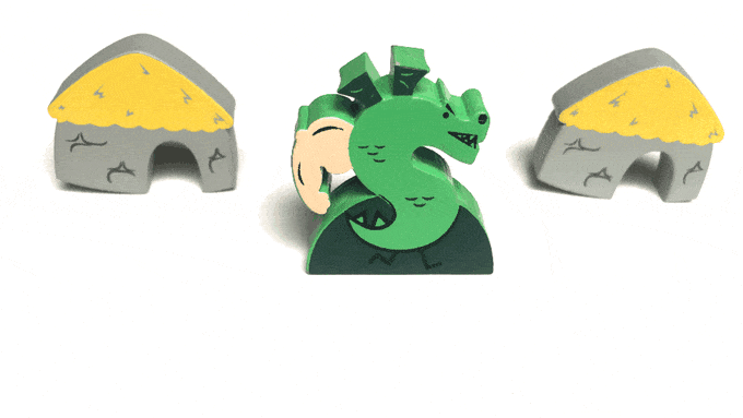
- It includes a lot of custom meeples, which are prominently advertised. Board gamers, based on a number of polls I’ve done on Facebook groups, Board Game Geek, and Twitter, are really into that. If you go run a poll on favorite components, custom meeples is likely to be in the top three.
- They have several reviews and testimonals. Some of them are from folks like Pendelton Ward and Alex Hirsch, creators of Adventure Time and Gravity Falls respectively. Others are from reviewers you’d traditionally associate with board games: Unfiltered Gamer and Pawn’s Perspective.
- They’ve got animated GIFs showing off pieces and gameplay. This trend has sprung up in the last couple of years. It’s worth paying attention to.
Even the top of the page alone suggests that it’s hitting some board gamer “yes” buttons. Sure, they emphasized Trogdor’s name the most prominently because Trogdor is awesome. But they also emphasized custom meeples and tiles, both of which are popular components. The project photo is staged in such a way that it shows off its table presence and hints at a larger game. The name is bright red and clearly draws the eye. A lot of thought has been put into this first impression!
The video makes this even more clear. Yes, it’s definitely a video made in the Homestar Runner brand, which makes their adherence to Kickstarter expectations even more remarkable. Remember: these are folks who have an audience and will get funded no matter what, but are choosing to push the product instead of the brand because they know it works.
The video is 2:39, a little on the long side. It starts in a goofy way, but that’s because of the brand. Then it shows off the components – a lot. Later they show gameplay and start describing how the game works. Their history allows them to focus on more than just the product, but they choose still to focus on the product.
Don’t take my interpretation purely at face value, though. You need to check other campaigns and analyze them to see how they operate. Pay attention to trends and see what you can make yourself. Start early, get feedback, be clear, follow the basic structure. If you do all this, you’ll be well on your way to making the perfect Kickstarter campaign page.


2 thoughts on “How to Create the Perfect Board Game Kickstarter Campaign Page”
I have a board that was created, but I’m having trouble getting it out to the world. Any advice on the direction I should take would be much appreciated.