Visualization brings data to life, unveiling hidden patterns and insights through accessible visuals, and empowering you and your organization to perceive the invisible, make informed decisions, and fully leverage your data.
Especially when working with large datasets, interaction can be difficult as render and compute times become prohibitive. Switching to RAPIDS libraries, such as cuDF, enables GPU acceleration that unlocks access to your data insights through a familiar pandas-like API. This post explains:
- Why speed matters for visualization, especially for large datasets
- How to use pandas-like features in RAPIDS for visualization
- How to use hvPlot, datashader, cuxfilter, and Plotly Dash
Why speed matters for visualization
While data visuals are an effective tool for explaining data insights at the end of a project, they should ideally be used throughout the data exploration and enriching process. Visualization excels at enhancing data understanding by finding outliers, anomalies, and patterns not easily surfaced by purely analytical methods. This has been demonstrated by Anscombe’s quartet and the infamous Datasaurus Dozen.
An effective chart applies data visualization design principles that take advantage of pre-attentive visual processing. This style of visualization is essentially a hack for the brain to understand large amounts of information quickly. However, interactions such as filtering, selecting, or rerendering points that are slower than 7-10 seconds result in a disruption of a user’s short-term memory and train of thought. This disruption creates friction in the analysis process. To learn more, see Powers of 10: Time Scales in User Experience.
Combining sub-second speed with easy integration, the RAPIDS suite of open-source software libraries is ideal for supplementing exploratory data analysis (EDA) work with visualization–driving fluid, consistent insights that lead to better outcomes during analysis projects.

Large data analysis workflows require more compute power
Pandas has made data work simpler, helping to build a strong Python visualization ecosystem. For example, tools like Bokeh, Plotly, and Matplotlib have enabled more people to regularly use visuals for data analysis.
But when an EDA workflow is processing data larger than 2 GB, and requires compute intensive tasks, CPU-based solutions can start to constrain the iterative exploration process.
Accelerated data visualization with RAPIDS
Replacing CPU-based libraries with the pandas-like RAPIDS GPU-accelerated libraries (such as cuDF) means you can keep a swift pace for your EDA process as data sizes increase between 2 and 10 GB. Visualization compute and render times are brought down to interactive speeds, unblocking the discovery process. Moreover, as the RAPIDS libraries work seamlessly together, you can chart many types of data (time series, geospatial, graphs) with simple, familiar Python code to incorporate throughout your workflows.
RAPIDS Visualization Guide
The RAPIDS Visualization Guide on GitHub demonstrates the features and benefits of visualization libraries working together. Based on the publicly available Divvy bike share historical trip data, the notebook showcases how a visualization-focused approach to EDA can improve using the following GPU enabled libraries:
Use hvPlot for easy data interactivity
hvPlot is a pandas-like plot API, but has built-in interactivity as shown in Figure 1.
df.hvplot.hist(y='duration_min', bins=20, title="Trips Duration Histogram")
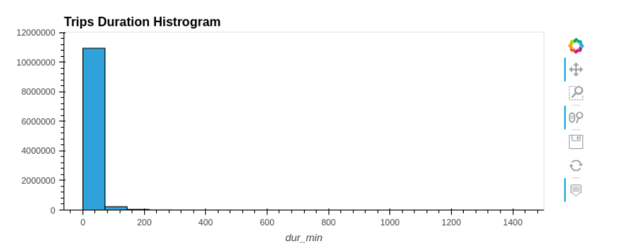
In this instance, the vast majority of bike trips appear under 20 minutes. Because of the ability to zoom in, you can also inspect the long tail of durations without creating another query. Augmenting the data using RAPIDS cuSpatial to quickly calculate distances also shows that most trips are relatively short.
Some hvPlot extras
Charts in hvPlot can be interactively displayed using Bokeh and Plotly extensions, or statically with the Matplotlib extension. Multiple charts can share axes by using the * operator, or in parallel for a basic layout with the + operator. More complicated dashboard layouts can be created with HoloViz Panel.
You can also automatically add simple widgets. For example, when using the built-in group by operation:
df.hvplot.heatmap(x='day_of_week', y='hour', C='count', groupby='month', widget_location='left_top')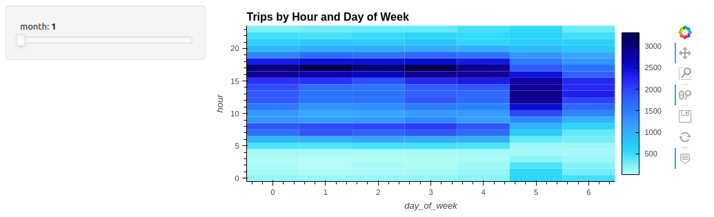
Adding a widget for interactivity enables scrubbing through the months to search for patterns over a full year (Figure 2). In visualization, “a slider is worth a thousand queries,” or in this case, 12.
Easy geospatial plotting
Geospatial charts with multiple options for the underlying tile maps can be shown by simply specifying geo=True:
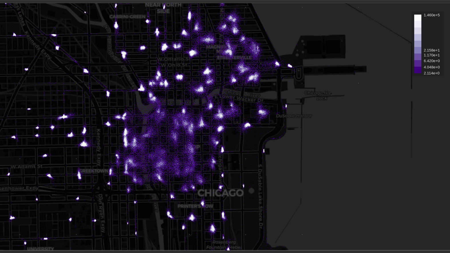
df.hvplot.hexbin(x='start_lng', y='start_lat', geo=True, tiles="OSM")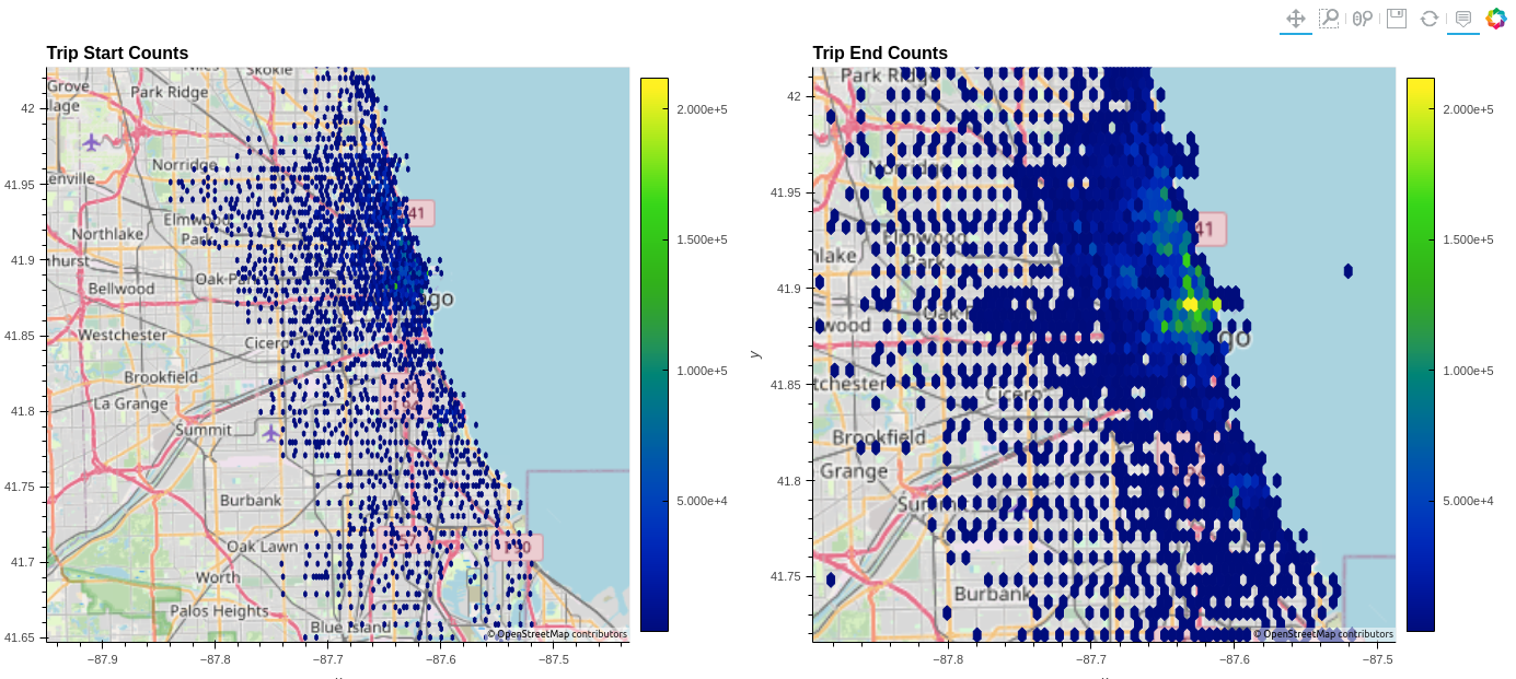
Figure 3 shows the hexbin chart that aggregates trip start and ending locations to a manageable amount, verifying that the data is accurate to the bike share system map. Setting two charts side by side with the plus operator illustrates the radiating nature of the bike network.
Use Datashader for large data and high precision charts
The Datashader library directly supports cuDF and can rapidly render over millions of aggregated points. You can use it by itself to render a variety of precise and high-density chart types. It is also easy to use in conjunction with other libraries, like hvPlot, by specifying datashade=True:
df.hvplot.points(x='start_lng', y='start_lat', geo=True, tiles="CartoDark", datashade=True, dynspread=True)
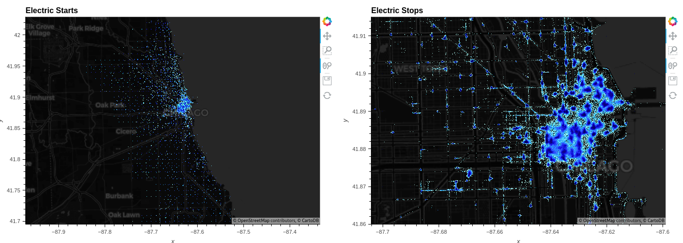
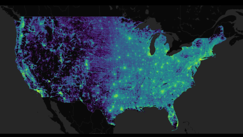
Datapoint rendering displaying high-resolution patterns is precisely what Datashader is designed for. In Figure 4, it clearly shows that while bikes tend to cluster, there is no guarantee that a bike will start or end a trip at a designated station.
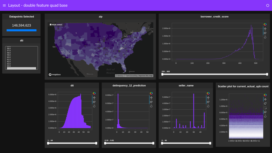
Use cuxfilter for accelerated cross-filtered dashboards
Instead of creating several individual group by and query operations, a cuxfilter dashboard can simply cross-link numerous charts to quickly find patterns or anomalies (Figure 5).
A few lines of code is all it takes to get a dashboard up and running:
cux_df = cuxfilter.DataFrame.from_dataframe(df)

# Specify charts
charts = [
    cuxfilter.charts.bar('dist_m', data_points=20 , title='Distance in M'),
    cuxfilter.charts.bar('dur_min', data_points=20 , title='Duration in Min'),
    cuxfilter.charts.bar('day_of_week', title='Day of Week'),
    cuxfilter.charts.bar('hour', title='Trips per Hour'),
    cuxfilter.charts.bar('day', title='Trips per Day'),
    cuxfilter.charts.bar('month', title='Trips per Month')
]

# Specify side panel widgets
widgets = [
            cuxfilter.charts.multi_select('year')
]

# Generate the dashboard and select a layout
d = cux_df.dashboard(charts, sidebar=widgets, layout=cuxfilter.layouts.two_by_three, theme=cuxfilter.themes.rapids, title='Bike Trips Dashboard')

# Update the yaxis ticker to an easily readable format
for i in charts:
    if hasattr(i.chart, 'yaxis'):
        i.chart.yaxis.formatter = NumeralTickFormatter(format="0,0")


# Show generates a full dashboard in another browser tab
d.show()
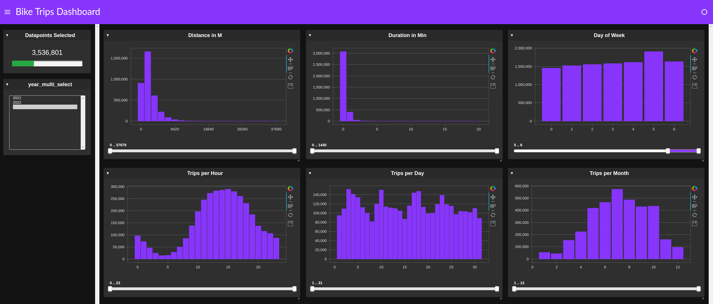
Using cuxfilter for quick, cross-filter-based exploration is another technique that can save time. This approach replaces dataframe queries with a GUI tool. As shown in Figure 5, a clear pattern emerges between weekday and weekend trips, as well as between daytime and evening.
Build powerful analytics applications with Plotly Dash
After data is properly formatted and augmented by an EDA process, making it more widely accessible and digestible for your organization can be a challenge. Plotly Dash enables data scientists to recast complex data and machine learning workflows as more accessible web applications.
For that reason, the findings from this notebook are encapsulated into a simple-to-use, accessible, and deployable app with Plotly Dash. The app uses the powerful analysis capabilities available with RAPIDS, but is controlled through an uncomplicated GUI.
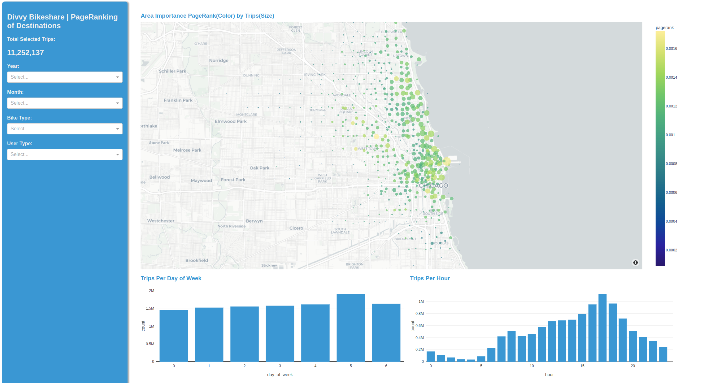
This instance uses cuML K-means to cluster the bike start and stop points into nodes and show each node’s relative importance with cuGraph’s PageRank. The latter is computed in real time for each of the weekend-weekday, and day-night patterns discovered earlier. We have started with raw usage patterns and now provide interactive insights into specific user-types and their preferred areas of town.
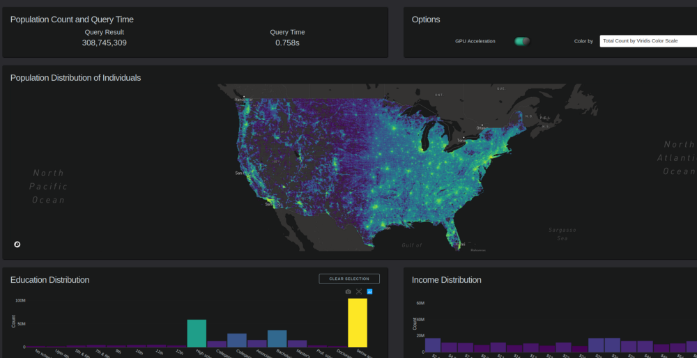
Subsecond interaction of 300M+ Census data points with Plotly Dash
For a more comprehensive Plotly Dash example, we updated the popular Census visualization with 2020 and migration data. Figure 7 shows the interactive performance benefits of using cuDF over pandas for millions of data points. For a sample demo, see the Census 2020 Visualization using Plotly-Dash + RAPIDS on Google Colab. For the full 300+ million dataset interaction, watch Visualizing Census Data with RAPIDS cuDF and Plotly Dash.
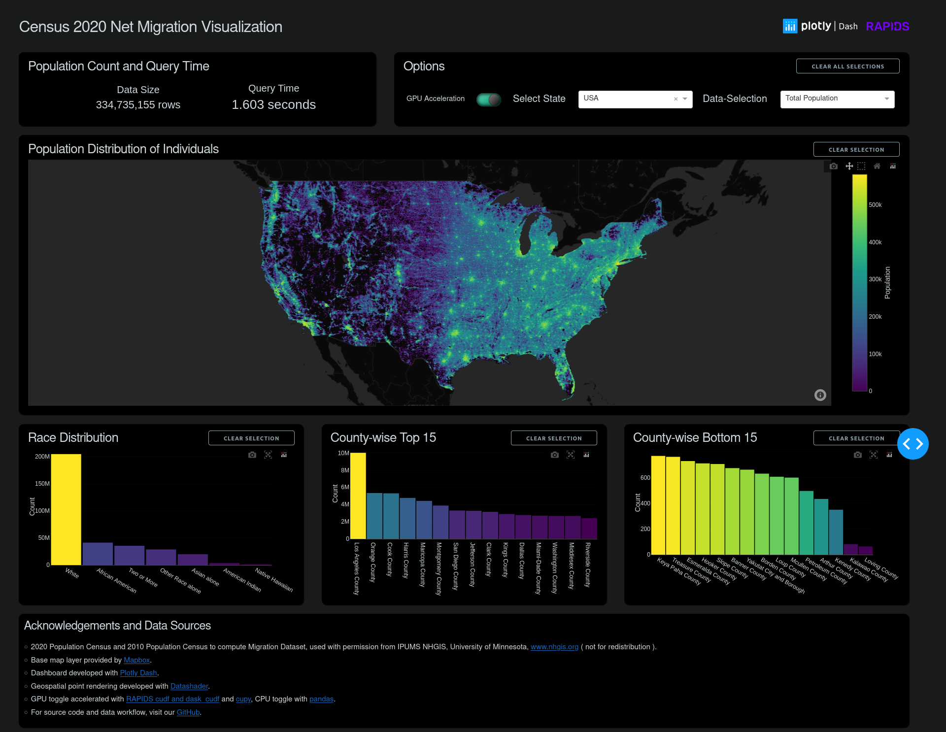
The 2020 and 2010 Census data were sourced with permission from IPUMS NHGIS, University of Minnesota. To more accurately represent the entire US population visually, the block-level data were expanded into per-individual points randomly placed within their block region, and calculated to match a block-level distribution. Several views are tabulated for that data, including total population and net migration values. For more details about formatting the data, see Plotly-Dash + RAPIDS Census 2020 Visualization GitHub page..
Using a powerful visualization, you can forget about the tool and become immersed in exploring the data. Some intriguing patterns emerge in this case:
- The Census block boundaries were changed, resulting in large roadways with their own separate blocks. This might be a result of a new push to better reflect unhoused populations.
- The eastern states show much less overall migration than the midwest and western states, except for a few hot spots.
- New developments, especially large ones, are particularly easy to spot and can serve as a quick visual comparison between regional policies affecting growth, land use, and population densities.
Data visualization at the speed of thought
By replacing pandas with RAPIDS frameworks such as cuDF, and taking advantage of the simplicity to integrate accelerated visualization frameworks, data analytics workflows can become faster, more insightful, more productive, and (just maybe) more enjoyable.
To learn more about speeding up your data science workflows, check out these resources:
- Accelerated data analytics series
- RAPIDS Visualization Guide
- Colab Census Visualization demo
- Census visualization video
This post is part of a series on accelerated data analytics.
Update 11/20/2023: RAPIDS cuDF now comes with a pandas accelerator mode that allows you to run existing pandas workflow on GPUs with up to 150x speed-up requiring zero code change while maintaining compatibility with third-party libraries. The code in this blog still functions as expected, but we recommend using the pandas accelerator mode for seamless experience. Learn more about the new release in this TechBlog post.