Q
Anonymous asked:
Why has every with some kind of “designated climbable ledge” mechanic seemingly settled on marking such ledges with yellow?
A
When we create a visual style for a game, we must establish a visual language. This means visual indicators that the player can recognize and understand. Here is an example of visual language that you might recognize:
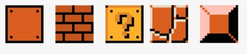
Each of these blocks provides gameplay context to the player upon seeing them. They each have different behaviors and the player can determine what each of them means by their visual cues.
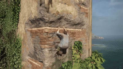
In a game with climbable ledges, players must be able to differentiate climbable ledges from non-climbable ledges. This necessitates some kind of visual indicator to differentiate the two, or players will get stuck/lost/frustrated. Note how you can almost instantaneously see the path here because the visual language is so well-defined.
The reason that so many games tend to choose yellow for that indicator is because yellow is a high contrast color that sticks out against just about any background color. Look at these real life photos and see how much the yellow sticks out compared to the other colors.


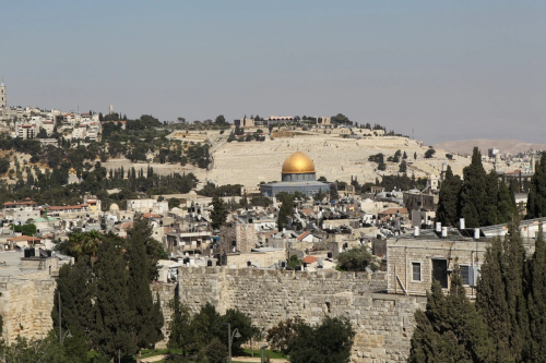
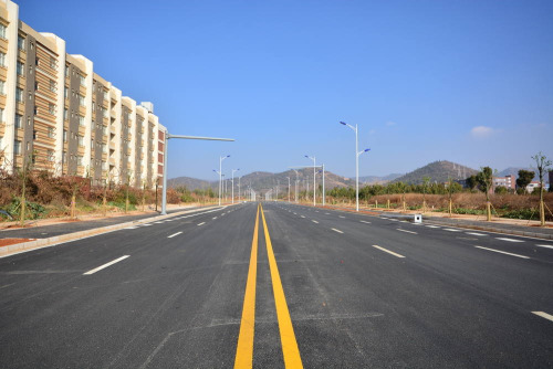
See how your eye is almost immediately drawn to the yellow elements in each picture? The reason you see so many interactable ledges marked with yellow is because it’s the brightest, most contrasting color that will pull player eyes to it almost immediately. For anything we absolutely don’t want players to miss, we will often use yellow to highlight it because it is the most obvious thing we can do short of putting enormous UI elements pointing at the thing and saying GO HERE.
[Join us on Discord] and/or [Support us on Patreon]
Got a burning question you want answered?
- Short questions: Ask a Game Dev on Twitter
- Long questions: Ask a Game Dev on Tumblr
- Frequent Questions: The FAQ
Notes
agentnoun reblogged this from askagamedev
 ralinsaur liked this
  brandonvout reblogged this from askagamedev
 - brandonvout liked this
madameevil liked this
 wuestenratte liked this
  richardtrevisani liked this
 teafaeyay said: Also a great reason why you don’t exclusively use color for indicators - spouse has yellow colorblindness, so only because it’s also usually a lighter contrasting shade can they see the climb indicators.
starwers reblogged this from askagamedev
 tw1stedsymph0ny liked this
 wizard-of-whispers reblogged this from askagamedev
 quiltmoss liked this
 supercomputer276 reblogged this from askagamedev
i-like-violet reblogged this from butterfly-sapphire
butterfly-sapphire reblogged this from theothin
chaosdukemon reblogged this from askagamedev
 jetlaggingbehind liked this
  sassydungeonmaster reblogged this from askagamedev
 - sassydungeonmaster liked this
yayforyuffie reblogged this from askagamedev
inayaeza liked this
therealbrigeedarocks liked this
theonethatshowsupinyournotes liked this
chivi-lazy-blog said: Specially in games with realistic graphics, you could get away with using other colours in more stylized games
aeviarth-the-dragoness liked this
deepseametro liked this
cadmusfly reblogged this from theothin
neververy4 reblogged this from bird-cannibalism
cardhoarder reblogged this from theothin
miniaturetyphoonhologram reblogged this from askagamedev
hypernousnight liked this
ceruleansageredux liked this
alicesoinions liked this
bird-cannibalism reblogged this from askagamedev
highdio liked this
yadelah liked this
isayoldbean liked this
 naiokiara liked this
 whythursdaynext reblogged this from askagamedev
vallyree12 liked this
almond-tofu-kun liked this
 askagamedev posted this
 Why has every with some kind of “designated climbable ledge” mechanic seemingly settled on marking such ledges with...
- Show more notes