I am developing a game in portrait orientation, and the main platform for implementation is mobile phones. To ensure proper display on mobile devices, I am using the fit Width scaling setting.
On desktop, I want the game to occupy the entire screen, with the active portion of the game occupying one-third of the screen in the center (the portion that is displayed in the mobile version).
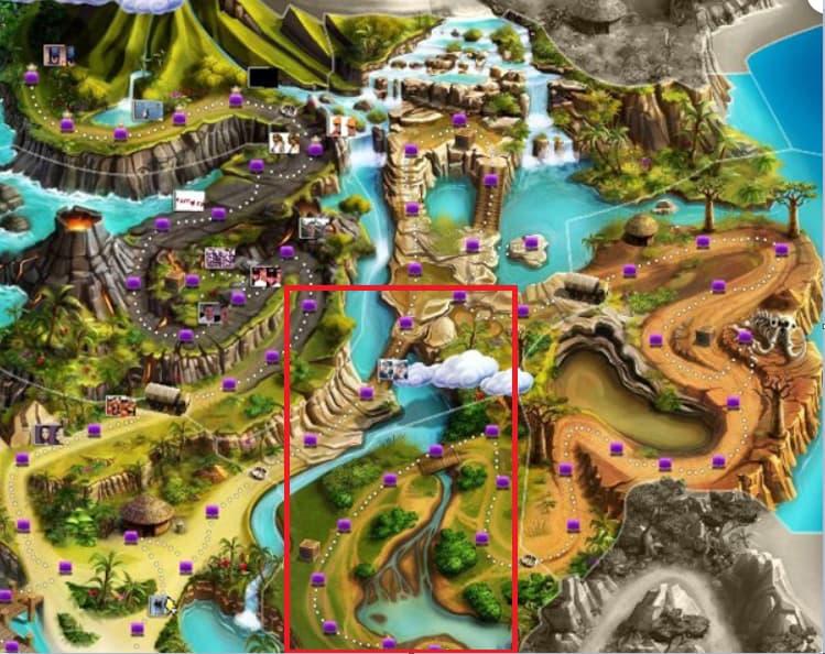
I have attached an example illustration to better explain what I need. The red frame represents how the game is displayed on mobile devices, and on desktop, the illustration should be displayed in its entirety, occupying all the available screen space.
Please advise on how to properly implement this approach.
Yes, it is necessary to adjust the display content of the game according to different platforms. sys.isMobile is used to determine whether the current game is running on a mobile device. Additionally, use the widget component to control the size scaling of the UI. You can refer to this document for more information about widgets: Widget Components